July 2004 :: Eichler Network: Enriching Your Modern Home’s Interior
View Story from the Eichler Network Newsletter – Page 1
View Story from the Eichler Network Newsletter – Page 2
View Story from the Eichler Network Newsletter – Page 3
View Story from the Eichler Network Newsletter – Page 4
View Story from the Eichler Network Newsletter – Page 5
Spotlight on Interior design – Eichler Art- PDF
The Eichler home collectors of the popular 50’s, 60’s style homes have featured my artwork in their expanding collectors newsletter. This is available both online and with their printed news circulation. View many artworks that compliment the Eichler experience!
Wall Art: The House Awakens
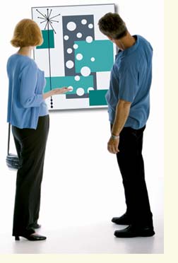 The artistic austerity of the Eichler homes creates both a challenge and an opportunity for owners when they look to personalize their own home interiors. And selecting and displaying art that harmonizes with the Eichler design’s modern aesthetic is surely part of this process.
But is there such a thing as Eichler-compatible art, and if so, how is it defined? Ask most Eichler owners if it exists, and you will hear: “Absolutely!” Ask them to define it, and responses become more varied: “You know it when you see it,” or “I can tell you what doesn’t work,” or “Look back at the classic modernism of the 1950s and ’60s,” or simply “Come to my house and I’ll show you.”
Stanford art professor and Eichler owner Matt Kahn began his decade as Eichler Homes’ aesthetic consultant in 1954 with the ambitious Eichler art experiment ‘Art About the House.’ Reaching the pages of Life magazine, this event brought together a Palo Alto Eichler home, a potpourri of art objects, and a throng of curious visitors.
Today, after a 50-year career immersed in art, Kahn still has much to say about the meaning of Eichler architecture and its relationship to filling it with furnishings and art. “I think one of the great achievements of the Eichler expression—maybe not one that was sought specifically—is that with so many houses so much alike, and so understated or simple in structure, they are very permissive,” Kahn points out. “Maybe they instigate you to do things with the house that you might not otherwise think to do if it were assertive in style. While you don’t fool around with a Frank Lloyd Wright house because of its assertiveness, you sure can with an Eichler home. And I think you should.”
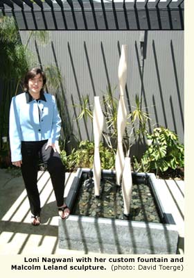
San Jose Eichler owner and real estate agent Loni Nagwani helps her clients prepare and stage their homes for sale, and in that capacity she is oftentimes responsible for selecting and exhibiting art for her clients. Nagwani, who has a keen eye for naturally integrating art—even the unusual—into her own Eichler, has found that above all else one should keep it simple. “You don’t need a lot of things,” Nagwani says. “In fact, one large, clean, modern piece—even a plant or sculpture—can have wonderful impact. And if you have mahogany walls, you can even leave one of them empty. I would rather have the wall bare than put things that don’t work on it or just fill it because it’s there.”
But what is art and why does it seem to capture so much of our imagination? Defining art is a little like trying to describe why a summer day may inspire the same awe as a cold winter one after the first snow. One Bay Area Eichler owner and art collector defines it this way: “Art is a representation of a mental image put on canvas. It makes you feel good when you look at it.” Art can be categorized by the media used (paintings in acrylic, oil or water color; line drawings; photographs; collage; weaving; or sculpture); by subject matter (people, places, still life, abstraction); or by some other unifying theme, such as family photos, our children’s finger-painting, or pieces collected during family vacations or world travels. Many things can function as art—but most of all, art is personal. It allows us to surround the space we live in by things that make us feel good, that remind us of fond memories of the past, or that set the stage or make a statement for guests as they enter our home.

But Kahn prefers originals to prints. “If you have originals of these artists, there is no question,” Kahn says. “But I would rather see perhaps a lesser piece that is an original than prints. There are an awful lot of major works by minor people, just as there are minor works by major people. Maybe at the residential level, those are the things we should be looking for.”
While the concept of geometric, mathematical shapes often comes to mind when thinking about modern or abstract art, other approaches are also fulfilling. Russian artist Wassily Kandinsky is sometimes credited with being one of the earlier artists to paint an abstract picture, and yet, like Spanish surrealist Joan Miro, his images are at once complex, with curved lines a heavy dose of movement. Today, reproductions of some of Kandinsky’s work can even be found in the IKEA catalogue. And Miro’s work is forever imprinted on the minds of jazz fans and lovers of modernism for its appearance on the album covers of pianist Dave Brubeck (“Time Out”; “Time Further Out”). In fact, according to Brubeck, the music contained in “Time Further Out” was inspired by Miro’s work.
Different approaches to wall art would include modern-inspired weavings and tapestries, or even sculptures of metal, glass, or wood. “Weaving is a structure,” says Kahn. “Strong contemporary weaving emphasizes the structure—and strong, contemporary architecture emphasizes the structure.”
There are other objects that function well as art. For example, glass pieces made by the Murano factory in Italy are fabulous in Eichler homes, especially if they can be positioned next to a pane of frosted glass and affected by the light of dawn and dusk. A Murano can make a strong color and design statement. Still in production today, real Muranos may cost several hundred dollars, but some pieces—including copies—are quite affordable. Stores such as Crate and Barrel carry some lovely Murano-inspired glass pieces.
Architectural pottery is another art element that is harmonious with the Eichler design and provides a three-dimensional approach to art. Stark and often created in either pure black or white, with a matte finish, these pieces can be larger in scale than the typical vase or planter. As such, they work well on the floor in front of a fireplace, or in the entryway. Nagwani chose to display her Malcom Leland architectural pottery in a custom-built fountain located in her atrium. For choice examples of architectural pottery, see www.architecturalpottery.com
Another important consideration is color selection. Artist and Granada Hills Eichler owner Mary-Margaret Stratton suggests that if you are lucky enough to have your original Philippine mahogany paneling, begin with earth tones, which coordinate so beautifully with the wood. “If you put art on the wall that is harmonious with the paneling, you have a house that is linked,” says Stratton. She also likes complementary colors. “I use a lot of oranges and rust. Some yellows. And I prefer warm undertones as opposed to cool undertones. I find that cool colors, such as ones with violet or burgundy undertones, are not as appropriate as the warm undertones.” As Kahn puts it, “Color is a great source of expression that has been twisted and perverted into merely being decorative. I think that color speaks to content. And it matters as a fundamental component in expressive works.”
Colors can be grouped in terms of the emotion they evoke. Cool colors of blue, green, turquoise, and silver are calming, while the warm colors of red, pink, yellow, gold, and orange are exciting. Neutral colors, such as brown, beige, ivory, gray, black, and white are considered unifying and help the viewer to focus on the colors that surround them.
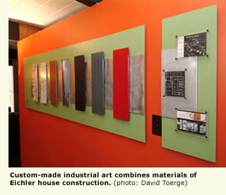
Photographs, especially black and white ones, are also popular with Eichler owners. Jeffrey Moreno, a designer with Atherton Kitchen Design Studio, points out that when selecting photographs for an Eichler, the framing is very important to the overall look and compatibility to the space. “Most important is to have plain, simple white or black framing,” says Moreno. “You don’t want anything that is heavy, and it should be as thin as possible. One classic look is white matting with a simple black metal frame. This works very well. Also, brushed aluminum and silver frames work well, since they provide an industrial look.”
Nagwani agrees that simplicity is important, and notes even potentially greater results when simplicity is combined with the concept of repetition. “Great and inexpensive art for Eichlers,” Nagwani points out, “are black and white family photos in simple black frames with white matte. To have a series of them on the wall is visually beautiful and effective in Eichler homes, because of the geometric aspect and the fact that all of the photos are related.”
Once you have searched for and found a piece of art that you like, it is time to decide where to place it. The ‘art of placing art’ can be quite a mystery, but the experts provide helpful advice. Moreno points out that one place to start is at the fireplace. “It makes a great focal point,” he says. “One large piece over the fireplace can make an impressive design statement. Other ideal placements include positioning one large piece on an open, bare wall or over the sofa.” Stratton agrees. “One very large piece works well, or a series of similar-sized solid pieces,” she claims. “When using a grouping of smaller pieces, I like to keep them all in the same size or color palette, so there’s a sense of continuity between each piece. What this does is to embrace the geometric simplicity of the Eichler.”

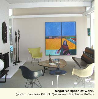
The proper height to hang your artwork is an individual decision and depends on the art and the location. However, the most common rule of thumb is the ’60-inch rule’—that in general, it is good to start by placing the piece so that its center is just at or slightly above eye level, or about 60 inches from the floor. In addition, Moreno stresses the importance of creating negative space around the art. “Negative space is very important to the Eichler design,” says Moreno. “A lot of Eichler’s design concept is about appreciating the architecture of the space, so that you are looking at the entire space—not just the art, but also the space around the art. Art surrounded by negative space makes a stronger focal-point statement than when it covers the wall.”
The proper amount of negative space varies and will depend on the art piece. According to Moreno, “If your art is busy, or has a lot of color or texture, you need more negative space.” As a rule of thumb, he recommends striving for at least 12 inches of negative space on each side and between eight and 12 inches on the bottom. “If you want a gallery look,” Moreno says, “you can almost span floor-to-ceiling if you have proper lighting. You just need to be careful that the art does not overwhelm the space.” For those who want more flexibility in the placement of art, try positioning free-standing pieces on a mantel, a free-floating shelf, a chair, an easel, or a console table.
One does not have to spend a lot of money on Eichler-compatible art. Our experienced collector resource for original art works claims that “you can get into real good art for anywhere from $500 to $5,000. And if you are thinking of it as an investment, you should try to buy the best thing you can afford, keeping in mind that one great piece is better than five lesser ones.” For those that love the search for the ultimate bargain, try local garage sales, flea markets, or even eBay. Finding art through these channels can be fun, and can even provide one opportunities to learn the stories behind the pieces of art.
Online sources such as art-prints-poster-books.com and art.com provide budget-sensitive sources for simple prints that can be purchased for less than $100, not including the frame. Or, as Stratton observed first hand, you can successfully make your own art. “One of my Eichler neighbors got a big square canvas and painted it blue. A pretty cornflower blue,” she says. “And that was his art. I swear, I walked into the room and my jaw dropped. It really worked.”
At the end of the day, the art that truly works best in your Eichler is something that you like, something that makes you feel good, something that harmonizes with the house.
But artist Kahn also cautions that one should be careful not to trivialize it. “Art is older than farming,” he says. “It has been around for such a long time that one does not simply develop sophistication in it through a magazine article. If you’re interested, you look at things. You visit galleries and museums. You read a little. You develop a kind of personal taste that’s related to larger cultural achievements that you learn from and want to relate to.”
“I worry about a formula or a recipe being used for art,” Kahn said in a concerned tone. “It’s fine if it makes people think. But it is not fine if it becomes a straight jacket.”
ART TO PONDER
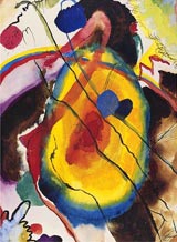
‘Study for a Panel’ by Wassily Kandinsky. Many of Kandinsky’s works are available as art prints and available from
www.allposters.com
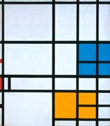
Here’s one of Piet Mondrian’s ‘Transatlantic Paintings.’ Oil on canvas. For many examples, see www.artmuseums. harvard.edu/mondrian

‘Eye on the Dawn’ by Lynne Taetzsch. Acrylic painting on canvas. Her work available from www.artbylt.com
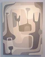
‘Untitled #6’ by Ty Best. Acrylic on linen. His work available from
www.velocity artanddesign.com
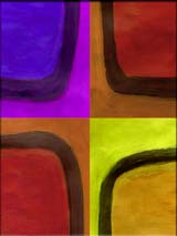
‘Union Square.’ As digital thermal prints from m-dc gallery. Available from www.md-canvas.com
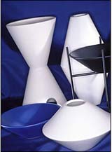
Vessel USA architectural pottery. These and other choice examples available from
www.architecturalpottery.com

George Nelson’s ‘Sunburst’ clock. Available from Design Within Reach at www.dwr.com
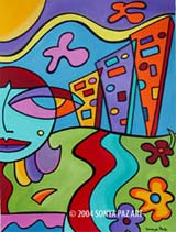
‘Sassy Girl in the City’ by Sonya Paz. Acrylic painting on paper.
Her work available from
www.sonyapaz.com

‘Modu Series No. 15’ by Campbell Laird Studio. Prints on canvas or watercolor paper. Many works available from
www.campbelllairdstudio.com

Commissioned painting by Palo Alto Eichler owner Judy Gittelsohn.
For many examples, visit
www.judyg.com
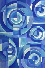
‘Texas in Blue’ by Christa Esquitin. Acrylic painting on canvas. Many works available from
www.oporb.com

‘Scorpio, Determined and Forceful’ by Shag. Acrylic and vinyl paint on board. Many works available from www.shag.com
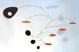
Modern mobiles by Julie Frith. Available from
http://www.frithmobiles.com

A Bertoia resonating ‘sound sculpture’ with silicon bronze rods. Available from
www.bertoiastudio.com


